In e-commerce, what really matters the most is the user experience. From the moment a potential customer lands on your website to the point they make a purchase, every step should be seamless.
Two critical components that play a significant role in this journey are the Product Listing Page (PLP) and the Product Detail Page (PDP).
Let’s delve into what these terms mean and why they are crucial for your e-commerce success.
What is PLP?
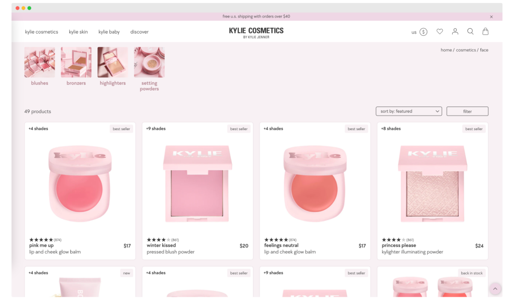
PLP, or Product Listing Page, is the webpage where multiple products are displayed, often in a catalog format. It serves as a gateway for customers to explore various products before diving into specific details. It’s the first impression that counts, and PLP ensures it’s a good one.
Key elements of PLP
Before we proceed, let’s understand the key elements that make up a PLP:
- Product Images: High-quality images that accurately represent the product. The better the image, the more it will attract customers.
- Product Titles: Short and descriptive titles that capture the essence of the product. A well-crafted title can significantly boost click-through rates.
- Price: Clearly displayed pricing information, including discounts if applicable. Transparency in pricing builds trust.
- Filters: Options to sort and filter products based on various attributes like price, brand, and ratings. Effective filters enhance user experience and facilitate quicker decision-making.
What is PDP?
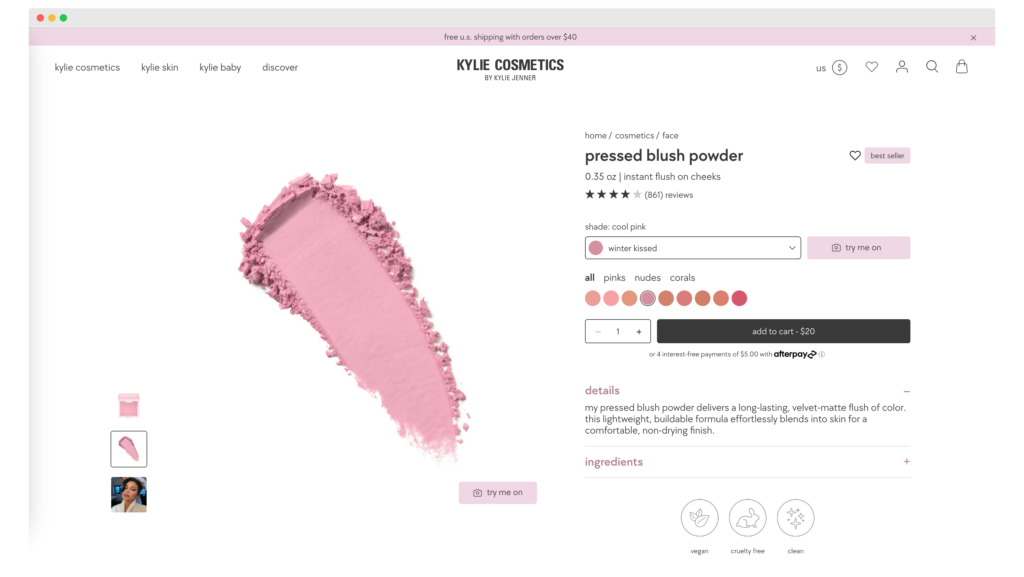
PDP stands for Product Detail Page. It’s the page where a single product is showcased in detail, providing all the information a customer needs to make a purchase decision. It’s the final pitstop before a customer decides to hit the ‘Buy’ button.
Key elements of PDP
A PDP is more than just a product and its price.
Here are its key elements:
- Detailed Product Descriptions: Comprehensive information about the product, including its features and benefits. A well-written description can be the difference between a sale and a pass.
- Customer Reviews: Authentic reviews from customers who have purchased the product. Reviews act as social proof and can significantly influence purchasing decisions.
- Add to Cart Button: A clearly visible and accessible button for adding the product to the shopping cart. The easier it is to find, the quicker the conversion.
- Related Products: Suggestions for other products that the customer might be interested in. This not only increases the average order value but also enhances the shopping experience.
PDP vs PLP: Key differences
User intent
PLP is designed for exploration, while PDP aims to convert. On a PLP, customers are usually in the browsing phase. On a PDP, they are closer to making a purchase.
Example: If you’re running an online clothing store, your PLP could feature a wide range of dresses, while the PDP for a specific dress would include sizes, colors, and a ‘Buy Now’ button.
Information density
PLP provides a snapshot, whereas PDP offers an in-depth view. PLP will have minimal information to allow for easy scanning, while PDP will have detailed descriptions, reviews, and even videos.
Example: On your PLP, you might show just the product image, name, and price. On the PDP, you could include a detailed description, fabric information, care instructions, and customer reviews.
Customization
PDPs are often more customizable than PLPs, allowing for personalized recommendations and dynamic content.
Example: On a PDP, you could show personalized accessory recommendations based on the user’s browsing history.
Navigation
PLPs are built for broad navigation and usually include filters and sorting options. PDPs focus on guiding the user toward making a purchase.
Example: On a PLP for electronic gadgets, you could offer filters by brand, price range, and customer ratings. On a PDP for a specific smartphone, you could guide the user to warranty options and checkout.
eCommerce PDP Best Practices
When it comes to optimizing your Product Detail Page (PDP), there are several best practices that can make a significant difference in conversion rates. Implementing these strategies effectively can not only enhance user experience but also drive sales. Let’s delve into these practices in detail.
High-quality images
Images are not just a nice-to-have but a necessity for any successful web page. Use high-resolution images that allow zooming to provide a detailed view of the product. For example, if you’re selling jewelry, offer a 360-degree view to showcase the intricacies.
Make sure to include multiple angles and perhaps even a video to give the customer a comprehensive understanding of what they’re buying. A picture is worth a thousand words, and in e-commerce, it could be worth a thousand sales.
Example: A furniture online store could offer a 3D view of a sofa, allowing customers to visualize it from all angles and even see how it would fit in a room setting.
Clear CTA buttons
The ‘Call to Action’ (CTA) is arguably the most critical element on your PDP. Make sure your ‘Add to Cart’ or ‘Buy Now’ buttons are prominently displayed. A/B test different colors and placements to find what drives the most clicks.
The CTA should be easy to find and compelling enough to click. Remember, a confused mind always says no, so keep your CTA straightforward and unmistakable.
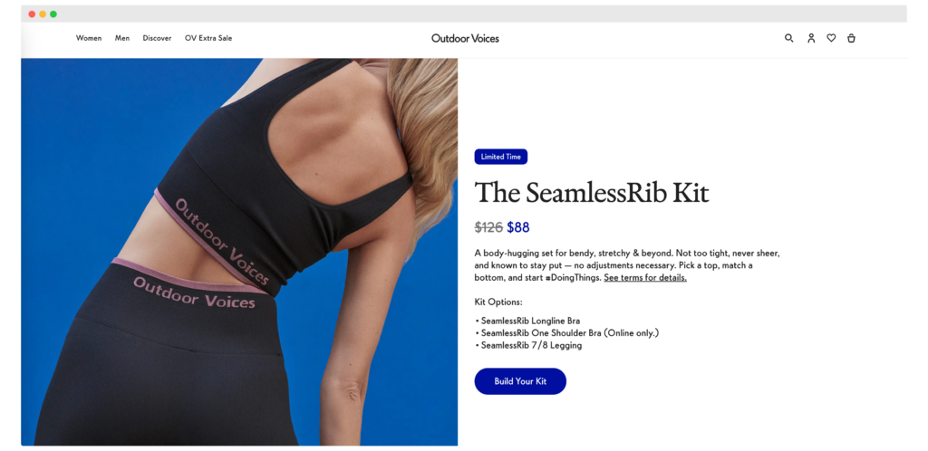
Example: An online bookstore could test a green ‘Add to Cart’ button against a red one to see which color encourages more clicks on a category page.
Social proof
Social proof, in the form of customer reviews and ratings, can significantly influence purchasing decisions. Include a section for these, and if possible, add user-generated content where customers can share photos of themselves using the product. Social proof adds a layer of credibility and can often be the tipping point for a customer who is on the fence about making a purchase. Encourage satisfied customers to leave reviews and perhaps offer a small incentive for doing so.
Example: A beauty brand could feature before-and-after photos from customers who have used their skincare products.
Mobile responsiveness
With the increasing number of mobile shoppers, having a mobile-responsive PDP is essential. Ensure your PDP looks and functions well on mobile devices. Test your page on various screen sizes to ensure that images are clear, text is readable, and buttons are easily clickable. A poor mobile experience can quickly deter a potential customer, so make sure your product detail page is up to par on all devices.
Example: A fashion retailer could implement a mobile-friendly size chart that’s easy to navigate on a smartphone, no matter the ecommerce platform.
Personalization
Personalization can be a game-changer in e-commerce. Use data analytics to offer personalized recommendations on your PDP. For instance, if a customer has been browsing winter coats, suggest matching scarves or gloves on the PDP. Personalization can increase the average order value and make the shopping experience more engaging and tailored to the individual customer.
Example: An online pet store could suggest specific toys or treats based on the breed of dog the customer has been looking at.
A/B testing
A/B testing is a powerful tool for optimizing your PDP. Regularly test different elements like CTAs, images, and descriptions to see what converts best. Use tools like Google Optimize to run these tests effectively. A/B testing allows you to make data-driven decisions and continuously improve your PDP based on actual user behavior.
Example: A tech store could test two different product descriptions for a laptop to see which one results in higher conversions.
Speed optimization
In today’s fast-paced world, speed is of the essence. Ensure your Product Detail Page loads quickly to reduce bounce rates. Compress images and use lazy loading techniques to improve page speed. A slow-loading page can be incredibly frustrating for users and may lead them to abandon the site altogether. Speed optimization is not just good for user experience but also benefits SEO.
Example: An online grocery store could use lazy loading for product images to ensure the page loads quickly even with a large number of items.
Cross-selling and upselling
Cross-selling and upselling techniques can significantly boost your average order value. Show related products or premium versions of the product the customer is viewing. Make these suggestions relevant and timely to encourage additional purchases.
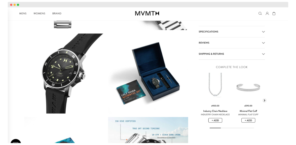
Example: If a customer is looking at a watch, suggest additional accessories as complementary products to complete the look.
Live chat support
Offering live chat support on your PDP can provide immediate assistance to customers who have questions or concerns. This real-time interaction can resolve doubts and lead to quicker conversions.
Example: A travel booking site could offer live chat support to answer questions about hotel amenities or travel insurance options.
Trust badges
Displaying trust badges on your PDP can enhance credibility and reassure customers that their transactions are secure. This can be particularly effective for lesser-known brands.
Example: An online pharmacy could display FDA approval and SSL secure payment badges to build trust.
Return policy
Clearly state your return and refund policy on the PDP. This removes a potential barrier to purchase as customers will feel more secure knowing they have the option to return the product if it doesn’t meet their expectations.
Example: An online shoe store could highlight a ’30-Day Money-Back Guarantee’ near the ‘Add to Cart’ button.
Video demonstrations
Including video demonstrations on your PDP can offer customers a more dynamic and comprehensive understanding of the product. Videos can showcase the product in action, highlight its features, and even provide quick tutorials on how to use it. This multimedia approach can significantly enhance the customer’s shopping experience and increase the likelihood of a purchase.
Example: An electronics retailer could include a video showing the unboxing and setup process for a new smartphone.
FAQ section
Adding a Frequently Asked Questions (FAQ) section to your PDP can preemptively address common queries or concerns customers may have. This section can cover topics like shipping, warranty, and product usage. By providing this information upfront, you reduce the customer’s need to navigate away from the PDP to find answers, thereby increasing the chances of conversion.
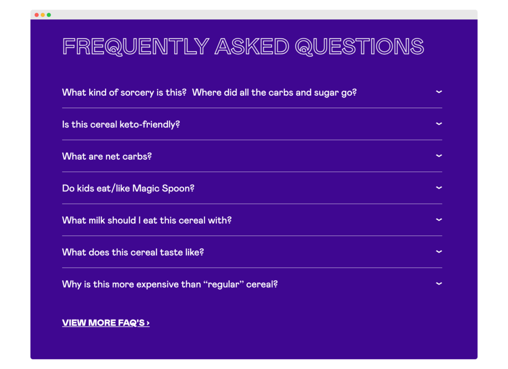
Example: A furniture store could include FAQs about assembly instructions, care tips, and warranty details.
Bundle offers
Bundle offers can be a great way to increase the average order value. By bundling related products together at a discounted rate, you not only provide value but also make it convenient for the customer to get everything they need in one go.
Example: A skincare brand could offer a bundle that includes a cleanser, toner, and moisturizer at a discounted rate compared to buying each product individually.
Real-time inventory updates
Showing real-time inventory levels can create a sense of urgency and encourage immediate action. If customers see that only a few items are left in stock, they are more likely to make a quick purchase decision. However, make sure that the inventory levels displayed are accurate to avoid customer frustration.
Example: An online fashion store could show a “Only 3 left in stock!” message next to popular items to prompt quick purchases.
Product Detail Page vs Product Listing Page: What (and when) is better?
The debate between the Product Listing Page (PLP) and the Product Detail Page (PDP) is a crucial one.
Both are key pages that serve as conversion components, but they cater to different stages of the customer journey.
The PLP, or product listing page, is often the category landing page where multiple products are displayed. It provides just the right amount of brief description with relevant keywords, product title, and high-quality images to entice potential customers. Shipping details and product categories are also often included to offer relevant information customers may seek.
On the other hand, the PDP, or product detail page, is designed to convert site visitors into customers. It provides detailed information, including installation instructions, shipping costs, and other relevant information customers may need. Good images are crucial for product detail pages too, along with product attributes like power consumption or industry awards that the product may have won. The PDP is also where urgency signals like product availability can make a huge difference.
So, when is each better?
PLPs are essential for search engines and form the backbone of your online store’s marketing strategy. They are the category pages that potential buyers land on from search engines. PDPs are the final frontier before a purchase, offering customers everything from shipping options to product details that can influence the buying decision.
Both are vital, but PLPs are more about attracting potential customers, while PDPs focus on sealing the deal. Therefore, a great product page is one that seamlessly integrates the general components of both product listing page and product details page, tailored to offer the most relevant experience to the users.
Creating a winning Product Details Page with Prodport
Prodport specializes in creating personalized product pages that convert. With features like AI-Driven Content Generation, Lightning-Fast Content Delivery, and Advanced Segmentation, Prodport allows you to easily increase conversions on your product pages. Their platform also offers powerful email and SMS campaign connectors to boost your campaign revenue. Trusted by millions, Prodport has shown to increase conversion rates by up to 46% and reduce bounce rates by 22%.
Key takeaways
- PLP and PDP serve different purposes in the customer journey.
- Both PLP and PDP have unique elements that need to be optimized for better conversions.
- Understanding the key differences between product listing pages and ecommerce product details page can help you tailor your e-commerce strategy.
- Utilizing platforms like Prodport can significantly enhance your PDP and overall e-commerce performance.
Conclusion
Understanding the nuances between PLP and PDP can significantly impact your e-commerce success. If you’re looking to optimize your ecommerce product detail page for maximum conversions, consider signing up for Prodport today.
